What's New?
This chapter features recent news and information about updates in FlexColorScheme. For a more detailed list of all changes, please refer to the package changelog.
Package
NEW
- Added boolean
sliderYear2023toFlexSubThemesDatato be able to select between older M3 and newer current M3 slider styles. Defaults to older style as before to not break styles. SetsliderYear2023to value false, to use the current newer M3 style. - Added
progressIndicatorThemetoFlexSubThemesto be able to themeCircularProgressIndicatorandLinearProgressIndicatorcomponents, with many new properties. - The
FlexSubThemes.cardThemegot new theming features.
CHANGE
- The enum
FlexSliderIndicatorTypegot a new valuerounded, to support selecting the newer M3 indicator style also in M2 and older M3 mode for Slider and RangeSlider.
Themes Playground
NEW
-
The Slider panel got a new switch control to select between older M3 and newer current M3 slider styles. It uses the new
FlexSubThemesData.sliderYear2023property to do so. -
Split the Tooltip and Progress Indicator panel into two separate panels.
-
The new Progress Indicator panel got theming controls for all supported new
FlexSubThemesDataprogress indicator properties listed above. -
The Card panel got theming controls for
FlexSubThemesDatacard propertiescardBackgroundSchemeColor,cardBorderSchemeColor,cardBorderWidthandcardElevation.
CHANGE
- Visual improvements to the color picker dialog in the Themes Playground.
For a detailed log of all changes, please see changelog on pub.dev on pub.
Version 8.3.0
August 15, 2025
Updated the package to support and require at least Flutter v3.35.0. It fixes the breaking theme chnages in Flutter 3.35.0 and also changes from using deprecated properties in 3.35.0 to newer properties that replace them.
For a detailed log of all changes, please see changelog on pub.dev on pub.
Version 8.2.0
March 23, 2025
Updated the package to support and require at least Flutter v3.29.0. Fixed all new analyzer lint warnings and removed usage of all deprecated properties. As a BETA feature Shadcn UI colors are available as theme colors. In the Themes Playground app you can also in the Premade Designs select a configuration that makes your Material theme to look and feel ShadcnUI inspired.
For a detailed log of all changes, please see changelog on pub.dev on pub.
Version 8.1.0
December 29, 2024
Updated the package to support and require at least Flutter v3.27.0. Fixed all new analyzer lint warnings and removed usage of all deprecated Color properties. Added theming properties for the Slider thumb color, BottomSheet clip behavior and TabBar indicator animation behavior properties.
For a detailed log of all changes, please see changelog on pub.dev on pub.
Version 8.0.0
November 3 and 13, 2024
Version 8.0.0 and 8.0.1 make FlexColorScheme fully aligned with Flutter's MAJOR BREAKING Material-3 theming changes introduced in Flutter version 3.22. Due to Flutter 3.22 breaking many past Material styles, introducing new colors to ColorScheme and deprecating three colors, FlexColorScheme had to undergo major revision and also break many of its past styles and some older APIs.
Most APIs are still there and work as before, but a few produce results that differ slightly from past ones, just like Flutter 3.22 also does over previous versions. Generally, the upgrade should be smooth, but you may need to review the produced theme result to see that you don't get any changes that don't fit with your design goals. Some past defaults have changed in FCS V8, but previous values are still available. You will need to enable them explicitly to get the same results as before. The purpose of these default value changes is to make FCS have less opinionated defaults, and be more aligned with Flutter's Material-3 design defaults. The Themes Playground app will still have some of its own opinionated defaults, done via default settings values the app uses in its default configuration, but the package Material-3 default starting points, are now much more aligned with Flutter's Material-3 defaults.
To migrate to the new version, see the summary in the Migration Guide. For a detailed log of all changes, please see changelog on pub.dev on pub.
Background
Flutter 3.22 introduced a large number of breaking changes to the ColorScheme and default color mappings that Flutter's Material components use. In total, the Flutter 3.22.0 release adjusted 249 of its own internal tests to accommodate for new Material-3 spec changes, that all broke past Flutter Material-3 component styles. For a reference to the broken and updated tests, see this issue comment.
New Features
FlexColorScheme V8 now allows you to use the new colors introduced in Flutter 3.22. As before, with FCS you can get fully defined hand-tuned ColorSchemes without using Material-3 design's Material Color Utilities (MCU) based seed-generated ColorSchemes. You may prefer to use seed generated ColorSchemes with Material-3, but it is nice to know you do not have to.
To the seed generated ColorSchemes, FCS adds support for all the Flutter DynamicSchemeVariant seed generated variants. It also improves them by allowing you to use separate seed colors for each palette. With Flutter's ColorScheme.fromSeed, you can only seed with one color, the primary color. The resulting ColorScheme always uses computed values for secondary and tertiary palettes, plus a hard coded fixed color for the error palette seeding. Surfaces colors are always tied to primary color as well and include a hint of primary color. With FCS, you do not have these limitations, you can seed with separate colors for each palette with even with Flutter's own dynamic scheme variants. This was always possible with FlexColorScheme and its FlexSeedScheme (FSS) based FlexTones, seed generated scheme variants. FCS now brings this feature to Flutter's own dynamic scheme variants as well.
As before, FCS also has its own even configurable FlexTones way of making seed generated ColorSchemes. Typically, you use predefined FlexTones, but you can also create your own FlexTones configurations. With it, you can define the chroma goals for each palette and define which tone is mapped to what ColorScheme color. An internal example of using them is the implementation of FlexTones modifiers.
FlexColorScheme V8 adds three new FlexTones modifiers. The most useful one is called monochromeSurfaces(). This tone modifier makes the surface shades of any used FlexTones configuration use monochrome greyscale shades for the surface and surface variant palettes. It thus gives us greyscale colors for ALL surfaces, instead of primary-tinted ones. It can be applied to any FlexTones seed generated scheme variant. The other new modifiers are expressiveOnContainer() and higherContrastFixed(). Check the API docs for more details.
The Themes Playground app got many new features:
- Support for customizing more component themes, like
ListTileandSearchBar, many component themes also got more theming options. - It can now export a Playground configuration to a JSON file. You can later import this JSON file to restore the Playground to the same state as when you exported it. This Playground feature was a nice contribution by GitHub user @akiller in !PR 257, thank you! This contributed feature got enhanced with more error handling and a slightly refined UI to make it production ready.
- You can convert an exported JSON configuration to a shareable link. This link can then be shared with other users. When the link is opened, the Themes Playground will reconfigure itself to the state it had when the shared settings were exported and converted to a link.
Version 7.3
August 16, 2023
FlexColorScheme v7.3 has been released. It is a minor feature release, but it is required if you use Flutter 3.13 for some theming features to work correctly.
- To
FlexSubThemesDataadded boolalignedDropdown. Setting it to true improves the style of the olderDropdownButtonand theDropdownButtonFormField. They no longer expand outside the width of the parent dropdown button, instead they are kept size aligned with the parent. FlexSubThemes.dropdownMenuTextStylenow default toTextTheme.bodyLargeif not defined. Previously it used Flutter SDK defaultTextTheme.bodyLarge. The new style is the correct Material-3 default and makes it fit with other text inputs. For more information see issue #131676.- The
FlexSubThemesData.useInputDecoratorThemeInDialogsnow also applies also toDatePickerDialogand not only toTimePickerDialog. This feature is not yet optimally supported by the framework. The current implementation has limitations. See additional info in PR #128950 comment. For more information about the differences in howInputDecorationThemebehaves in different component themes, read the proposal "Make InputDecorationTheme usage in components consistent" in issue #131666. - Fixed the
FlexSubThemes.checkboxThemethat broke due to an unexpected breaking change in Flutter 3.13 caused by PR #125643 that also impacts M2 theming. This undocumented Flutter breaking change (it is not mentioned here) is discussed further in issue #130295. The fix to the Checkbox theme incorporates the new behavior, to keep its custom styling working as before and expected. The new styling options are better and more flexible, but they could have been added without a silent breaking style change.
Themes Playground
- The PopupMenu and Dropdowns panel got a setting for older Material-2 based
DropdownButtonFormFieldandDropdownButtonto set the alignment property. - On the TextField panel, added a feature to set the input decoration style back to FlexColorScheme's own defaults, in addition to the M3 defaults.
- Harmonized custom color activation settings on Theme Colors and Seeded ColorScheme.
Read more about what else is new, fixed and changed in the detailed FlexColorScheme 7.3 changelog.
Version 7.2
July 20, 2023
FlexColorScheme v7.2 has been released. It contains many new features, like:
- Visual density setting, with platform adaptive features.
- Platform adaptive splash ink effects, keep Android's default Material splash effects on Android, but use instant splash on other platforms.
- Platform adaptive theming of dialog border radius.
- Switch with fixed thumb size in Material-3 mode.
- Text selection theme customization.
- Two new cool ColorScheme seed generation strategies called Candy Pop and Chroma.
- Make any seed strategy use tone 100 (white) or tone 0 (black) as resulting surface and background tones.
Themes Playground
The Themes Playground continues to move forward. Its different theming topic panels have been broken down into smaller topics. Their order have been revised and related topics have received group-based color coded icons. This should make it easier to navigate around all the topics and available options. The icon colors are fixed semantic colors, but the colors are Material-3 harmonized to active theme surface tint color. This makes them fit nicely when the overall color theme of the app changes. It is also a nice additional demo of theme extensions, with many colors that are harmonized to the theme. The concept is the same as the one used on the code highlighter colors earlier.
The Playground also continues improving its in-app documentation and offers more info and documentation that can be expanded via the (i) info icon on each setting and topics. Naturally, there is support in the Themes Playground for using all the above new FlexColorScheme features. New is also settings to use previously existing APIs to define own border radius on DatePicker and TimePicker dialogs. Useful in case you want them to be different from the general dialog border radius. By default, the TimePicker and DatePicker dialogs use the same border radius as the general dialog radius uses.
Read more about what else is new, fixed and changed in the detailed FlexColorScheme 7.2 changelog.
Version 7.1
May 12, 2023
FlexColorScheme v7.1 has been released. It is updated to support the latest Flutter version 3.10. Since it uses new theming features not available before it, it actually requires Flutter 3.10.0 or later.
The SKIA canvaskit renderer is again being used to build all the web examples, including the Themes Playground. It now runs much better than in version 7.0 built with Flutter 3.7, where the html WEB renderer had to be used to build the app, due to issues with WEB SKIA CanvasKit in Flutter 3.7. These CanvasKit issues are solved and gone in Flutter 3.10 and the faster, sharper and more accurate CanvasKit SKIA web renderer can be used again.
The Themes Playground and tutorial example apps built and using FlexColorScheme v7.1 and Flutter 3.10 can be found here:
- Example 1: Basic Theme
- Example 2: Custom Theme
- Example 3: Four Themes
- Example 4: All Themes
- Example 5: Themes Playground
Read more about what else is new in the FlexColorScheme 7.1 changelog. Version 7.1 is a much smaller and incremental upgrade than 7.0 was. Version 7.0 already included much preparation for this Flutter release.
Version 7.0
April 2, 2023
TLDR
For a slideshow tour of what is new in version 7, check out this Tweet and its thread, where Flutter Dash talks you through all the major new features.
The Themes Playground app built for this release is unfortunately not a SKIA canvaskit renderer build, it is using the HTML renderer. This makes it less performant than the app would otherwise be. Additionally, scaled content, like the Themes Simulator panel, is also fuzzier than it would be with the SKIA renderer. Due to an issue in Flutter 3.7, a build made with the SKIA renderer performs very poorly and crashes quickly. For more information see Flutter issue #122189. When the issue has been fixed and is available in the Flutter stable channel, a new version of the Themes Playground will be built and released using the SKIA renderer.
Breaking APIs?
There are a few minor breaking APIs in version 7 compared to version 6. Most likely, you will not run into them. However, some past styles and defaults have been slightly tuned to align themes with Material-3 design. The number of new features in FlexColorScheme and Themes Playground from previous beta are significant, for a detailed list of changes from version 6.1.2 to version 7.0.0, please see the changelogs listed below:
-
Changes from 7.0.0-dev.3 to 7.0.0
- Package: Only tests and documentation additions and updates.
- Playground: Label and layout corrections.
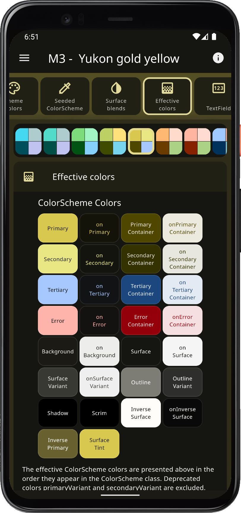
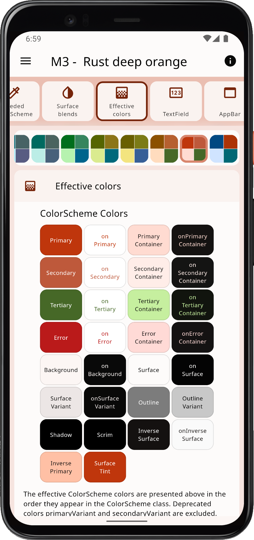
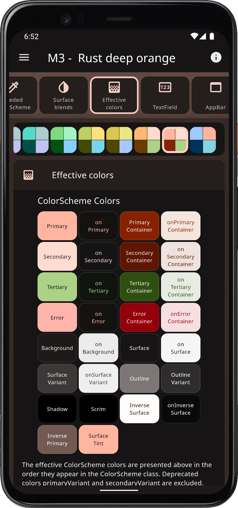
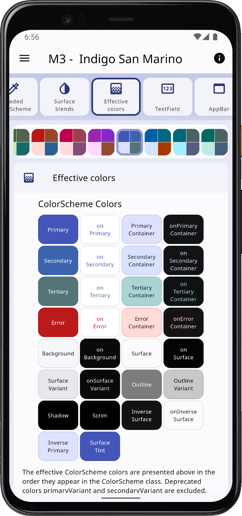
Twelve New ColorSchemes
Version 7 also comes with 12 new M3 ColorScheme themes, for a total of 52, now FlexColorScheme holds all the cards. The additional color schemes can be used as such, and provide a good M3 color system fit as they are. For an even better M3 aligned style, use seeded color schemes. They work well with only primary key color as seed, but are also tuned to work if you enable their secondary and tertiary colors as key colors for seeding the ColorScheme. For a more conservative seed-generated ColorScheme, do not use secondary color as a seed color. This applies generally to seeded ColorScheme generation.
 |  |  |  |
Flexible Seeded Color Schemes
You can customize how the seeded ColorScheme is generated from key colors. The default option is the Material-3 and Flutter standard ColorScheme.fromSeed used configuration. With the API, you have complete control of how it behaves. It also comes with eight preconfigured options, in addition to the Material-3 used default one. These options can be selected in the Themes Playground, custom configurations are only available via the API.
If you want to make things even more color expressive, you can chase the surface tint and blend color to another color than the theme primary color. When you use a custom surface blend color in surface color blending, the same color is now also used as seed key color for the neutral colors (surfaces and backgrounds) when you use M3 ColorScheme seed generation. In Material-3 default design, the primary color is always used as seed for the slightly tinted surface colors. With FlexColorScheme, you can customize this to any other color than your used theme primary color. Go easy on it though, not everything will look good, but you can certainly create interesting unique looking apps with it.
Platform Adaptive Themes
FlexColorScheme now offers platform adaptive themes. There are a few theming properties that can have a platform adaptive response. You can, for example, give all widgets in your application a different general border radius on iOS and macOS, and still keep Material-3 border radius on Android. There are not so many platform adaptive properties in this release, but they hit where it counts to make it possible to make using Material-3 mode less opinionated on e.g. iOS.
For each platform adaptive feature, you can completely customize on what platform the adaptive optional theming value should be used. Each platform's web usage is also considered a separate platform. Learn more about this feature in the API docs about the FlexAdaptive class used to configure when the adaptive behavior for each platform adaptive setting gets applied.
Color expressive interaction and disabled controls
For some combinations of colors, Material-3 does a good job of making interactions like pressed, focus, hovered, more color expressive than before. For some widgets, it does not do so well. If you in Material-3 deviate from default color choices for widgets, especially if the brightness is different, interaction effects may become invisible or too weak. With FlexColorScheme you can use more consistently color expressive interaction effects. You can also separately opt-in on color-tinted disabled controls. These changes are often quite subtle, and give you a more refined consistently color expressive theme. On smaller widgets, you might not even notice it as it can be quite subtle. On larger surface areas, like clickable [ListTile] the differences are quite obvious.
Some widgets have gaps in their theming capabilities or plain bugs that made it impossible to always make this feature as refined as it should be. When issues related to those bugs and gaps are solved, they will be added as fixes to styles in flexColorscheme and not as breaking style changes. The known issues chapter contains a list of tracked theming issues, also related to this feature.
 | 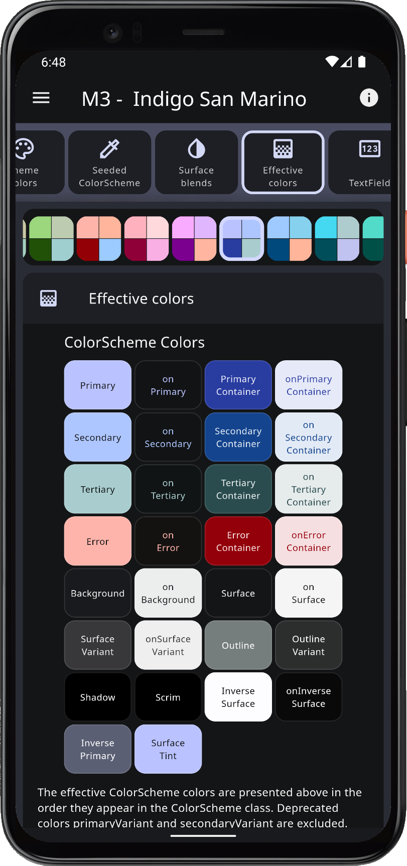 | 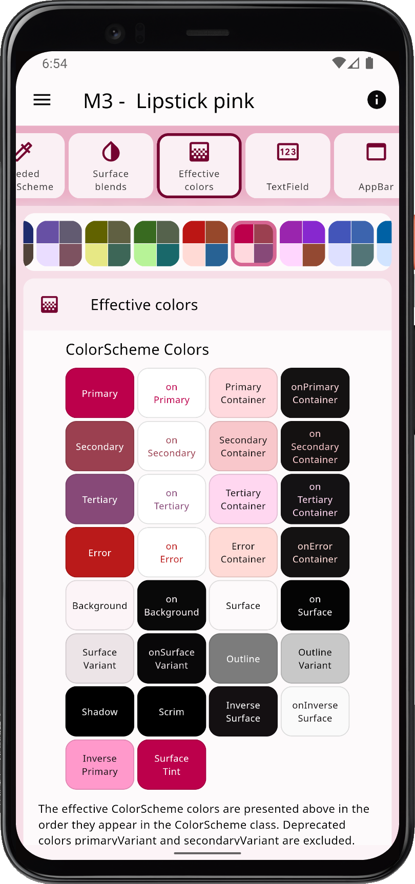 | 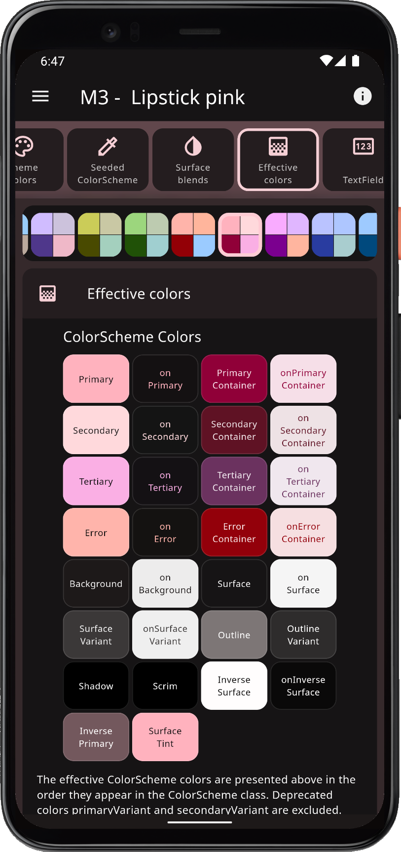 |
Support for M3 Components
Version 7 includes component theming support for new Material-3 design widgets in Flutter 3.7, and improved styling and settings for most Material UI widgets. They typically match Material-3 default style, when opting in on Material-3 and using sub-themes in FlexColorScheme. Some widgets had their own styles in Material-3 mode, already in previous versions of FlexColorScheme. Those styles were established long before Material-3 was available or very useful in Flutter. For these widgets, it was opted to not break their past default style when opting in on Material-3 and sub-themes. However, for the concerned widgets, TextField (InputDecorator), NavigationBar and NavigationRail, the Themes Playground offers a Set to M3 button that configures them to match their Material-3 defaults as well, if so desired.
The new filled FilledButton and tonal FilledButton.tonal buttons are now available. The theming capabilities of these new buttons are a bit limited. Theming their colors, changes the colors of both buttons, and you thus no longer get two different button styles. This is a limitation in current version of Flutter. The situation may be improved in later Flutter versions. It is recommended to keep their colors as they are by default. Changing other parts of their theme in sync, like e.g. border radius is often desired, this works and is still usable. Together with Elevated, Outlined and Text buttons, you now get a very complete button set out-of-the-box, using most of the common colors in the theme's color scheme.
The new menus in Flutter 3.7 are great additions to Flutter's component portfolio. The same underlying component is used for the menu in DropDownMenu, MenuBar and MenuAnchor. The DropDownMenu is a very capable dropdown menu, now available in Flutter SDK out-of-the box. The MenuBar is great for desktop apps. It supports nested menus and keyboard shortcuts deep into the nested menus. The MenuAnchor is like one menu from a MenuBar, that you can attach to any widget. A common use case is right- or control-click, based context menus. For the new menus, FlexColorScheme offers extensive theming customizations. There are still some styling limitations due to a few lacking features and bugs in Flutter, but a lot can be done to customize them already now.
The DropdownMenu has a TextField input part, it follows the general TextField input decoration you define in FlexColorScheme. In version 7, there are more quick config options available for the TextField and its InputDecoratior. Another neat synergy with menus is that for the menu options in the MenuBar and its menu options, the same ButtonStyleButton that the normal Material buttons use, is used as their building block. If you are familiar with raw custom theming of the ButtonStyleButton Material buttons, with their complex but versatile MaterialState, you already know how to theme or style the menu selection options.
Themes Playground v7
There are many other new components and configurable component sub-theme settings in FlexColorScheme for you to explore. You can do so easily in version 7 of the Themes Playground.
Version 7 of the Themes Playground has many new and exciting features, its chapter will need to be completely rewritten. In addition to offering settings for all the new components it supports, it offers more configuration options for many past ones as well. The three most important new features are:
-
Theme preview: Use this feature to see how your design looks on a few built-in example applications. You can try them on different devices. One of the built-in preview example apps is the official Material-3 demo app from the Flutter team. When you change your theme design, the demo apps are modified according as well.
-
New layouts: The page view is now more useful. You can choose which two panels you want to see side-by-side. Great for checking how a setting impacts things in API code, or on colors, or how settings change the design of the demo apps in Theme preview. There is also a more compact layout and toggling the theme color selector to be on the side, instead of on top. These new layouts are great for smaller desktops, so you can see more of things that matter. Useful if you are not using a 4k monitor at native resolution.
-
Premade designs: Use them to learn what FlexColorScheme can do, or as starting points for your own theme designs. The premade designs do not change the used color scheme. They only change widget designs, like which colors from the color scheme they use, their border radius, adaptive feature usage, is a seeded color scheme used or not, etc. Try them to see how theming can completely change how an app looks. The Theme preview feature is great to set as a side view when selecting premade designs, to see what happens to their design as you toggle between premade configurations. As always, the Themes Playground app itself also reacts to all theming config changes applied by selected premade designs, plus the generated API code to use it, is also updated.
Links to V7 Web App Builds
The tutorial and example apps built and using FlexColorScheme v7 can be found here:
- Example 1: Basic Theme
- Example 2: Custom Theme
- Example 3: Four Themes
- Example 4: All Themes
- Example 5: Themes Playground
Version 6.1
FlexColorScheme version 6.1.0 contains many new features, more component sub-themes and configurable properties. It improves seed-generated color scheme capabilities by adding more pre-configured seed generation configurations and color contrast accessibility options.
A criticism of Material-3's color system and seed-generated color schemes, is that using colored contrasting colors may be less accessible. FlexColorScheme offers a way to enable in-app modification of its M3-style seed-generated color schemes. Any seed generation configuration can optionally return results with plain white and black contrasting on colors. This can be applied separately for main on-colors and surface on-colors.
The Themes Playground application has been updated to include most of the new features. It has been improved to make it easier to discover some of its previously existing features, like using custom colors in the Playground to define your own theme.
Some minor style changes exist when opting in on opinionated component sub-themes, they bring the Material-2 mode component themes closer in alignment with Material-3 styles. For a detailed list of changes, please refer to the package changelog.
For a slideshow tour of what is new, check out this Tweet and its thread, where Flutter Dash talks you through the major new features.
Version 6.0
This is a breaking release. For a complete list of all changes, see change log. Generated API docs are available and up to date with version 6. This release requires at least Flutter 3.3.0 and Dart 2.18.0. It uses theming features in Flutter SDK that do not exist in earlier versions.
BREAKING
- FlexColorScheme no longer directly depends on package Material Color Utilities package, which is also used by Flutter SDK. Instead, it uses package FlexSeedScheme that depends on it. As a part of this change classes
FlexTones,FlexTonalPaletteandFlexCorePalettewhere moved into the package FlexSeedScheme. FlexColorScheme still exports these classes. If you were using them directly before, you can still do so without adding the FlexSeedScheme package.- In FlexSeedScheme,
FlexTonescontains a minor breaking change to make the API cleaner. TheFlexTones.lightandFlexTones.darkno longer produce the config for the Material-3 tone and chroma setup. They no longer lock the chroma values to the default values for M3, but use null in their configs for their chroma values. Resulting in that chroma from key colors will be used, as long as they are over set minimum values. - In FlexSeedScheme
FlexCorePalette.fromSeedspropertiessecondaryChromaandtertiaryChromanow default to null instead of previous M3 palette default generating values 16 and 24 respectively. Set them to values 16 and 24 to create same tonal palettes as Material Color UtilitiesCorePaletteand previous versions ofFlexCorePalette. - To allow for greater flexibility, and for the addition of tonal palette tones 5 (custom for FCS) and 98 (Google Material-3 Web theme builder app includes tone 98 to, but not Flutter SDK),
FlexCorePaletteno longer extendsCorePalette, it is a modified re-implementation. - In FlexSeedScheme the
FlexTonalPalettemethodasListand constructorfromList, now include the values of the error color in produced asList, and as required values in fromList.
- In FlexSeedScheme,
STYLE CHANGES
-
Updated
ElevatedButtonto supportuseMaterial3defaults concerning its switched foreground and background color roles. It now also uses stadium border instead of 20dp, M3 size, padding and elevation defaults, whenuseMaterial3is opted in on. The switched default color values, compared to M2, are to make it compliant with the M3 style by default. You can configure it back to M2 style in M3 mode if you so prefer, by setting background color toprimaryand the foreground color tosurfaceoronPrimary, for a more M2 styledElevatedButton. Material-3 will also offer two new button styles, calledFilledButtonandFilledButton.tonal, which in their default color style are more likeElevatedButtonin Material-2, but without elevation. These buttons are, however, not yet available in Flutter 3.3. When Flutter stable supports them, they will be added to FlexColorScheme as well. -
Updated
OutlinedButtonto supportuseMaterial3defaults concerning its outline color default. It now also uses stadium border instead of 20dp, M3 size and padding, whenuseMaterial3is opted in on. -
Updated
TextButtonto supportuseMaterial3defaults concerning its usage of the stadium border, instead of 20 dp radius, as well M3 size and padding, whenuseMaterial3is opted in on. -
FlexSubThemesData.fabUseShapeopinionated component theme style default was changed fromtruetofalse, this breaks previous default style. The opinionated style change was done to use a style that by default matches M3 style whenThemeData.useMaterial3istrue. The new default style is also a way to work around issue #107946, where it is shown that you cannot create a theme that replicates the default rounding in M3 of the FAB, by offering it as default. Style migration: If you had keptFlexSubThemesData.fabUseShapeunspecified and relied on default value in a previous version, you must set it totrueto get the same result as before. Breaking style changes like this, in the opinionated opt-in component sub-themes are unfortunate, but required as FlexColorScheme continues to evolve with Flutter SDK to support Material-3 theming. -
The opt-in opinionated tinted text themes were made less aggressive on the tint amount and also received a bit of opacity on styles that in 2014/2018/2021
Typographyhave opacity. The custom styles use significantly less opacity, since they also get alpha-blended tint color applied. Combining it with the same level of opacity would make them too low contrast. -
The main text theme now uses
surfaceTintcolor instead ofprimarywhen tinted text theme is enabled. By defaultsurfaceTintequalsprimary, but if themesurfaceTintis set to use a custom color, the for surface tinted textTheme is now also based on it. This makes it match the custom tinted surfaces as well. The primary text theme, that fits on primary color, still always usesprimarycolor as its tint color. -
The
FlexAppBarStyleproperty was made nullable. It now defaults to null in all constructors. When it is null anduseMaterial3is false, the app bar will use styleFlexAppBarStyle.primaryin light mode as default, like before andFlexAppBarStyle.materialin dark mode. However, ifuseMaterial3is true, then it will useFlexAppBarStyle.surfacein both light and dark mode, to match the un-themed defaults of Material-3 designAppBar. -
Changed opinionated dialog sub-theme defaults to match M3 defaults. Elevation now set to 6, it was 10 and actionsPadding defaults to
EdgeInsets.only(left: 24.0, right: 24.0, bottom: 24.0), it did not have a custom default before. These are new defaults for the opinionated dialog sub-theme for both the M2 and M3 mode. -
Updated
Chipsub-theme when opting in onuseMaterial3. Whentrueit now uses M3-styled Chips instead of its own opinionated custom style, also when the opinionated component sub-themes are enabled. To get the same opinionated coloring as before, but on the M3 styled chips when using M3, set component sub-themes datasubThemesData: const FlexSubThemesData(chipSchemeColor: SchemeColor.primary). -
Updated
InputDecorationdefault sub-theme when opting in onuseMaterial3. Whentrueit now results in a more upcoming M3 styledTextFieldstyle by default, instead of its own more opinionated custom style, also when the opinionated component sub-themes are enabled. It still uses a lot of its own styles, in M3 mode, because TextField's real M3 design is not yet available in Flutter 3.3.- TextField's FCS opinionated style, combined with M3 real defaults, will need more work on M3 styles after "Migrate TextField to Material-3" lands in the stable channel. The M3 alignment of FCS
InputDecorationplanned adjustments are:- Using the same error container color idea, for the FCS defaults that M3 uses, could be OK for both modes.
- Option to use FCS component defaults on fill colors and disabled colors, also when opting in on M3. These FCS defaults can provide a nice alternative also when opting in on M3, but we should not force it on M3 unless asked for.
- TextField's FCS opinionated style, combined with M3 real defaults, will need more work on M3 styles after "Migrate TextField to Material-3" lands in the stable channel. The M3 alignment of FCS
BREAKING: REMOVED DEPRECATED MEMBERS
All previously deprecated members have been removed from version 6.0.0. FCS no longer has any self-deprecated members. This removes legacy backwards compatibility with deprecated members from versions 2, 3 and 4, and even one from version 5.1.0. The removed deprecated members are:
- FlexSubThemesData:
inputDecorationRadius,bottomNavigationBarSchemeColor,navigationBarIsStyled,navigationBarTextSchemeColor,navigationBarMutedUnselectedText,navigationBarIconSchemeColor,navigationBarHighlightSchemeColor. - FlexColorScheme:
primaryVariant,secondaryVariant,useSubThemes. Removed staticFlexColorScheme.m3TextThemedeprecated in 5.1.0 and staticFlexColorScheme.themedSystemNavigationBarin version 2 its deprecated parameternullContextBackground. - FlexThemeData:
primaryVariant,secondaryVariant,useSubThemes. - FlexSchemeColor:
primaryVariant,secondaryVariant. - SchemeColor:
primaryVariant,secondaryVariant. - FlexConstants:
kDarkenSecondaryVariant,kDarkenSecondaryVariantFromSecondary,kDarkenPrimaryVariant. - FlexSubThemes.bottomNavigationBar:
baseSchemeColor. - FlexSubThemes.navigationBarTheme:
textSchemeColor,unselectedTextSchemeColor,mutedUnselectedText,iconSchemeColor,highlightSchemeColor.
Version 5.1
Updated to support latest Flutter package dependencies in example apps. Supports and requires at least Flutter 3.0.0 and Dart 2.17.0.
NEW FEATURES
-
Added support for in Flutter 3.0.0 new
ColorScheme.surfaceTintcolor. It is set toColorScheme.primarycolor by default, as Flutter and Material-3 does. If a customsurfaceTintcolor is provided, it is also used as the blend color, instead ofprimarycolor, for FlexColorScheme's surface blend feature. -
Added API for using Flutter 3.0.0 theme extensions directly via FlexColorScheme API. It was added as a convenience feature in order to avoid having to add theme extensions with a
copyWithon FlexColorScheme produced ThemeData. With theFlexColorScheme.extensionsandFlexThemeData.extensionsproperties you can add custom theme extensions directly.
STYLE CHANGES
-
Floating Action Button background color, will when opting in on
ThemeData.useMaterial3, use colortheme.colorScheme.primaryContainer, otherwisetheme.colorScheme.secondaryis used. -
The
TextFieldand itsInputDecoratorborder radius default value was changed from 20 dp to 16 dp when using opinionated component themes. If opting in on Material-3, the default value for M3 design is used, which is only 4 dp. See specification https://m3.material.io/components/text-fields/specs. Flutter 3.0.x does not yet implement the new M3 TextField style, but via this change when opting in on M3, FlexColorScheme offers an early approximation of it. -
Default colors of
NavigationBarwhen opting in onuseMaterial3and not using opinionated component themes will now match M3 default colors. The background color will follow M3 style also by default when component themes are enabled anduseMaterial3is true. This style is difficult to replicate with a single color otherwise. The difference is subtle for FCS surface tinted background colors. You can still set it tobackgroundcolor to replicate past FCS default color when sub-themes were enabled. For other properties, if opinionated component themes are not used, FCS will use default M3 theme styles onNavigationBarwhenuseMaterial3is true. If opting in on opinionated component themes, FCS uses its own custom and opinionated default style. This can be modified to be the same as the default M3 style too. The change also includes a default font size change for FCS opinionated styled navigation bar, from 11 dp to 12 dp. This change was done to harmonize it with its M3 style. -
Default colors of
NavigationRailwhen opting in onuseMaterial3and not using opinionated component themes will now match M3 default colors. If opinionated component themes are not used, FCS will use default M3 theme styles onNavigationRailwhenuseMaterial3is true. If opting in on opinionated component themes, FCS uses its own custom and opinionated default style. That can be modified to be the same as the default M3 style too. The change also includes a default font size change for FCS opinionated styled rail, from 14 dp to 12 dp. This change was done to harmonize it with its M3 style. -
Default color of toggles (
Switch,CheckboxandRadio) are now usingprimarycolor as their default theme color, when opting in on opinionated component themes or settingThemeData.useMaterial3to true. TheSwitch,CheckboxandRadiothemes then use a style that match the M3 color design intent. In it, switches and toggles use primary color. In M3 color design, the secondary color is a poor choice for switches and toggles, and it is therefore not used as their default color. It does not look nice with M3-based ColorSchemes, created by e.g., using M3 color seeding. If you use a custom M3 color design, where secondary color is still prominent, you can, of course, still use it.
Version 5.0
FlexColorScheme Version 5 is a large upgrade from version 4, with deprecation of previous variant based color names in favor of container ones that were added to updated Material-3 based ColorScheme in Flutter 2.10.0. The same additions and changes are now also introduced in FlexColorScheme. Despite being a big release, with many new features, actual breaking changes are very few and mostly concerns in version 4 already deprecated members, and requiring minimum Flutter 2.10.0 to work.
Version 5 has many new advanced coloring features and fully supports Material-3 color schemes, including seeded key color generated color schemes. With more configuration options to generate the ColorScheme from key colors, compared to what is currently available in Flutter SDK. Version 5 also comes with many more convenient component sub-theming options compared to previous versions.
The open source companion app, the Themes Playground has been completely revised. It now has two view modes, the previous large masonry grid and also a convenient topic-based page view. In the new version, you can also see the generated theme setup code as you change your theming settings.
This is a breaking release, with many new Material-3 ColorScheme features. See change log for detailed change information.
The example apps have all been updated. New live web builds for v5 are available here:
Version 5 of the Themes Playground application demonstrates all the new features, including using Material-3 key color, seeded color schemes. The playground has its own usage guide chapter. The updated Copy Playground Theme template can be used to quickly test themes using copy-pasted setup code from the Playground.
The default example, the Hot Reload Playground has also been updated. Its comments contain extensive documentation that serves as a getting started guide as well.
For a guided tour of what is new, check out this Tweet and its thread, where Flutter Dash explains all the new features in a dashing slide series.
The slides in the tweet thread is using the Themes Playground app from the 5.0.0-dev.1 release. The final released version 5 of the app is a lot fancier, but all the FlexColorScheme V5 and also later V6 features and principles are the same as in the above thread. It is still a useful quick guide.
New Themes in Version 5
There are, of course, new built-in color schemes in version 5. Four new themes are a de-facto standard for major new releases. The new color schemes are:
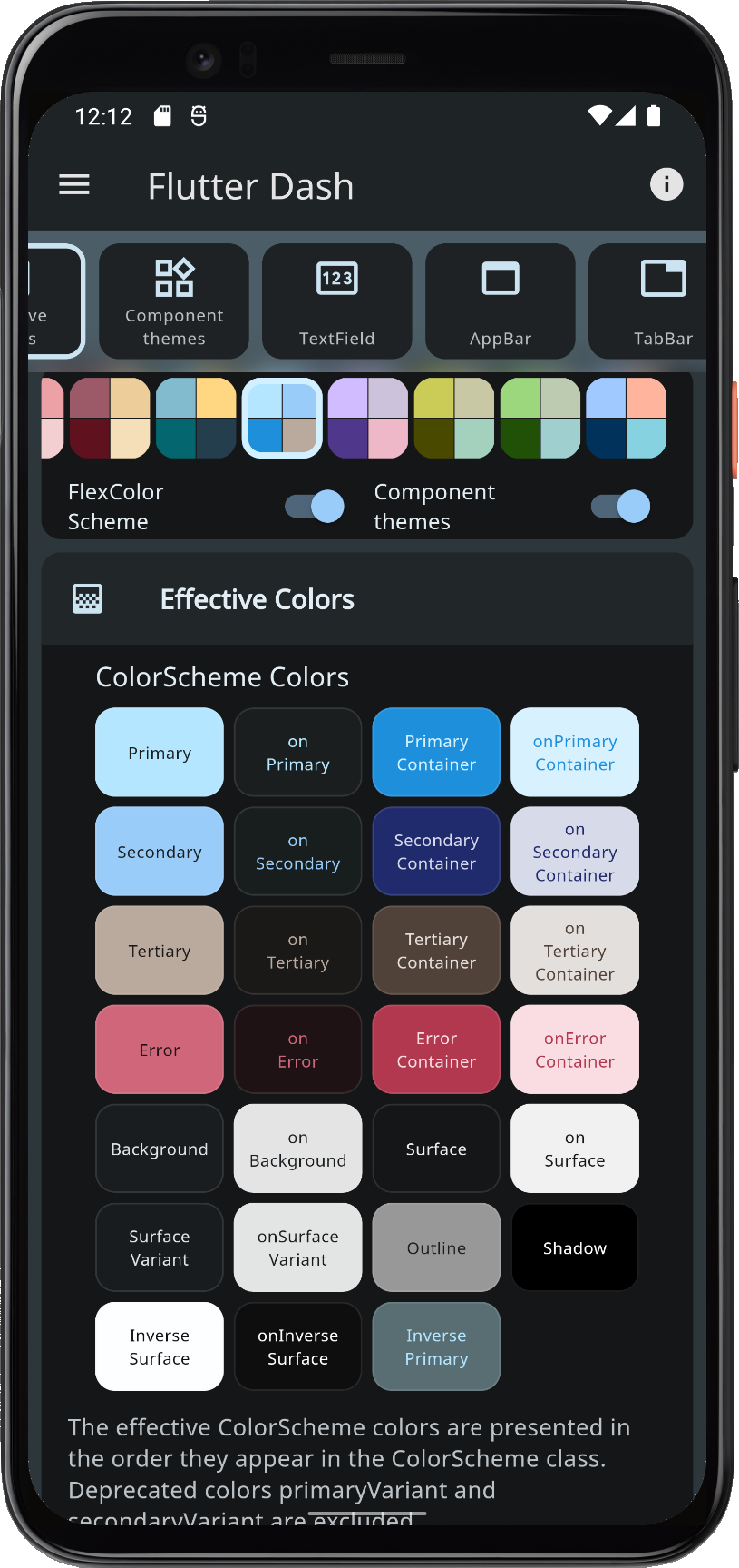
- Flutter Dash, a blue Flutter Dash wallpaper-based Material-3 theme.
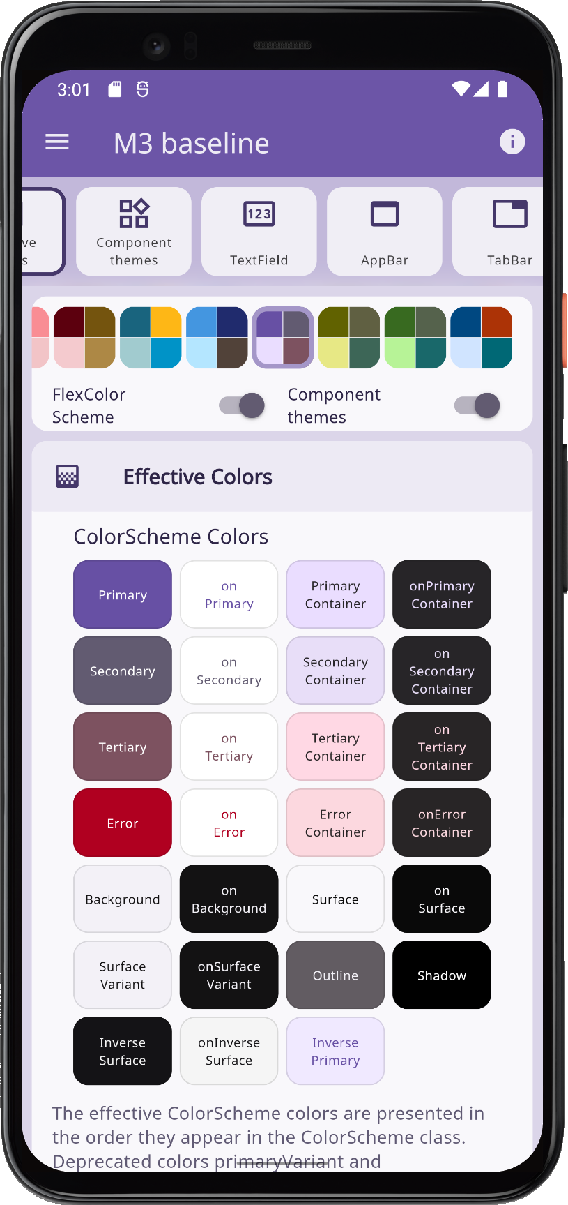
- M3 baseline, Material-3 guide baseline-based theme.
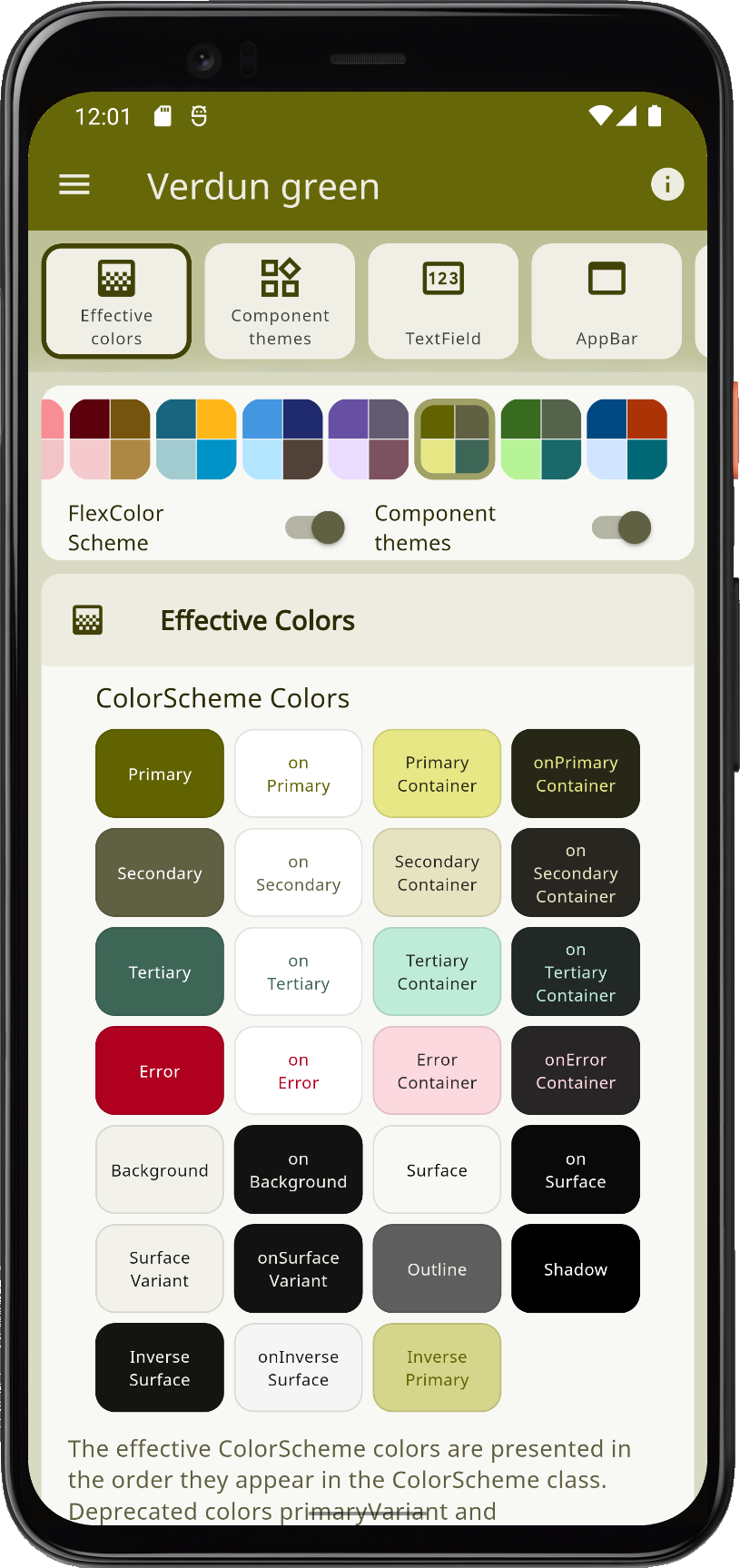
- Verdun green and mineral green with hemlock, based Material-3 theme.
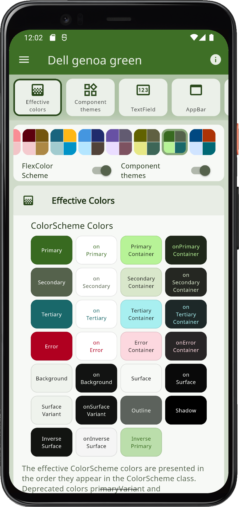
- Dell genoa green, a Material-3 theme with dell, axolotl and genoa greens.
| Flutter Dash | M3 Baseline | Verdun Green | Dell Genoa Green |
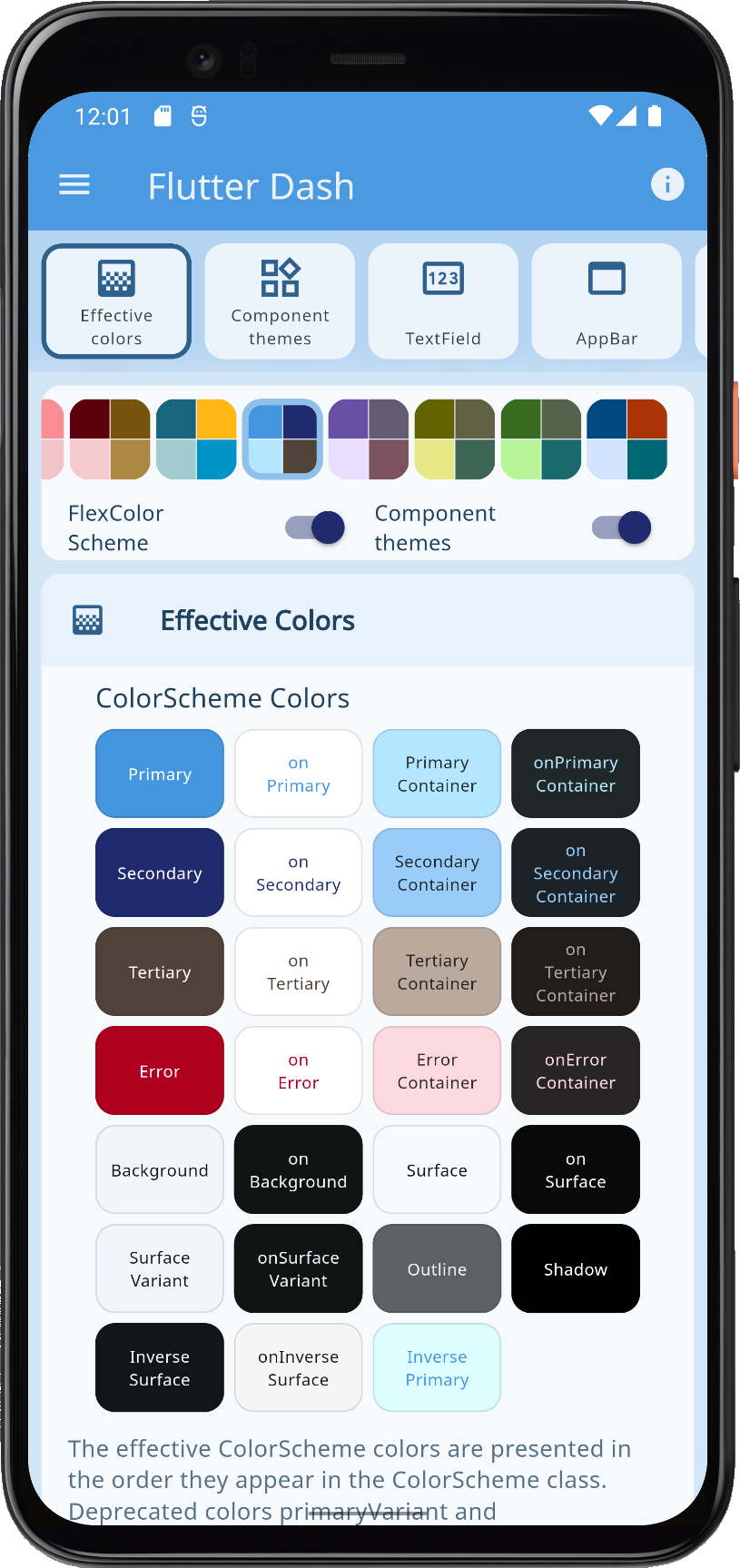 |  |  |  |
 |  | 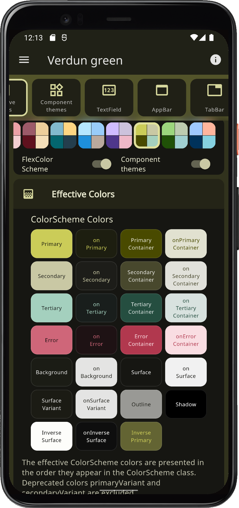 | 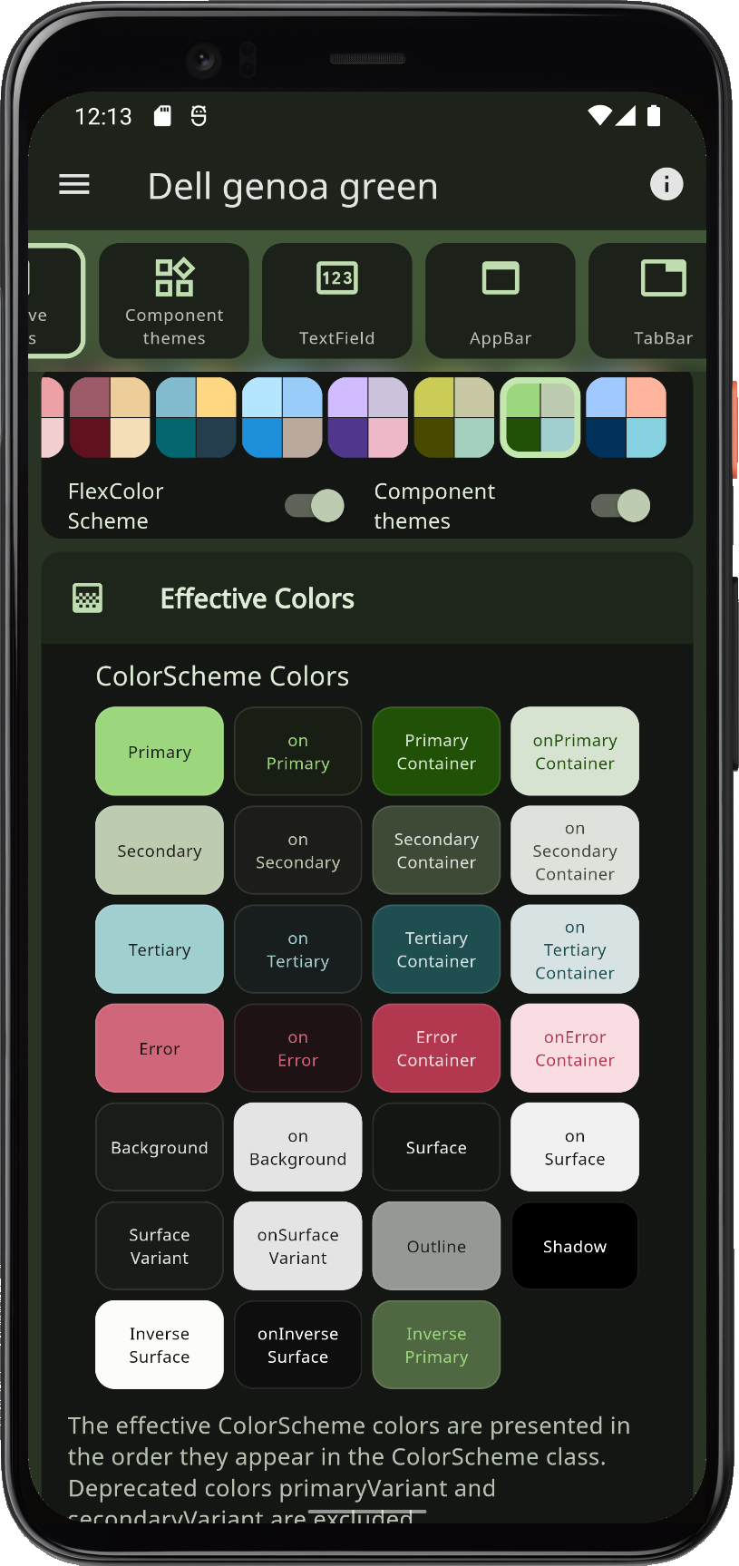 |
Version 4.0
There are two major new features. The first one is that FlexColorScheme now comes with opinionated widget sub themes that you can opt in on. By default, these Flutter UI component widget sub-themes follow the Material-3 guide. This is done as far as reasonably possible while still using standard Material-2 theming features available in Flutter 2.8. There is a Material-3 TextTheme as well. By default, this text theme is also slightly color tinted using the color scheme's primary color. You can turn these styles on and off, based on your own preferences when you opt in on the sub themes.
The second main new feature is that FlexColorScheme now offers 9 different surface color blend modes, with 40 different blend levels each. Version 3 only had one "blend style" with 5 levels, including the no blend option. The version 3 blend style API is still available and works, but is deprecated since version 4.2.0. Despite the major version bump from 3 to 4, all APIs from version 3 are fully compatible with version 4. The version was mostly bumped because it contains so many new features that it made sense.
There are, of course, new built-in color schemes. Four of them seem to be the standard for major new releases. The new color schemes are:
- Blue whale, with jungle green and outrageous tango orange.
- San Juan, and pink salmon theme.
- Rosewood, with horses neck and driftwood theme.
- Blumine, easter blue and saffron mango theme.
The total number of offered built-in color schemes is now 36 matched light and dark pairs. By using the swap primary and secondary colors, you can double the number of variations with just a boolean toggle. Not all the color schemes are so attractive when you swap the colors, but some were designed to support it and look well with the colors reversed too. You can, for example, use this to present the dark mode with primary and secondary colors swapped compared to the light mode.
You can check out this Tweet and its thread for a visual presentation of FlexColorScheme's features.
